The traditional pub bar is pretty annoying and badly designed
If you were designing a counter for the service of beer would you put a row of posts between the person serving and the customer?
Would you also put large display cards on each of those posts, and a charity collection tin to one side, and till on the other?
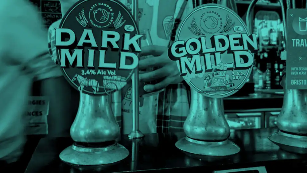
Multiple times in recent weeks we’ve watched bar staff awkwardly pass pints between handpulls, or around one side, only to spill some on the way and have to spider claw the glass back for a refill.
Once you notice it, you see it happening all the time and you think, huh, this really isn’t a very good layout.
That’s probably why modern craft beer bars and micropubs, built from scratch, with less of an obligation to observe tradition, often have their pumps and taps somewhere behind the bar, on the back wall. That leaves the counter gloriously free for the placing of pints, the dabbing of debit cards, and other little bits of business that accompany the sale and purchase of beer.
It even means you’ve got room for even more charity collection tins, jars of dog biscuits, hampers of deep fried snacks, or stacks of cheese rolls, if that’s how you want to play it.
So why on earth did the traditional pub counter evolve this way?
A symptom of greater choice
This arrangement was, we suspect, absolutely fine when most pubs carried two or perhaps three different draught beers.
You could pull the pints at the beer engine and pass them to the customer somewhere else along the mostly empty expanse of bar.
John Henry Henshall’s famous 1882 painting ‘The Public Bar’ depicts a crowded bar with a very substantial beer engine and yet there is still a clear stretch of counter right next to it.
Other drawings, paintings and photographs of pubs from before about 1950 show bar counters with even less clutter, and fewer handpumps. And those handpumps had no pumpclips, or at least only fairly small ones – not the great heraldic shields you get today.
In the post-war period, although the accepted story is of a reduction in choice for the beer consumer, what actually happened was that cask ales was joined on the counter by keg beers, draught lager, and draught (nitro) stout.
These new products, the result of considerable investment by breweries, were marketed hard which meant increasingly elaborate and prominent boxes or fonts.
Cut to 2026 and a typical pub, like The Langton, might have eight handpumps for ale and 14 taps or fonts for lager, kegged craft beer and draught cider. And those keg fonts are no joke, towering things designed to be in your eyeline, and incidentally blocking you and the bar staff from each other’s sight.
Dead space is expensive
The other problem is that, as pubs diversify their offer in search of every penny that might help them stay afloat, any counter space there is becomes a tempting spot for:
- cake stands
- rentable charging bars
- coffee machines
- snacks
- any other ‘upsell’ they can think of
This isn’t new, obviously – we grew up in the hot pie warmer era, and sandwiches under cloches were not uncommon in pubs as far back as the 1930s. But, really, some pubs today sweat that space to a quite remarkable degree.
Then there’s the matter of modern electronic point of sale (EPOS) systems. Even the sleek iPad-on-a-pole type takes up more of that space between the customer and the server than the old fashioned cash register used to.
None of this matters, really. It’s been this way for a long time and we all just deal with it, even if it means watching the glass we’re about to drink from make its perilous way between obstacles with the rim gripped between the fingers of a stranger.